Showing posts with label Christy. Show all posts

Tuesday, 2 June 2015

Volunteering at The Royal Highland Fusiliers Museum


-->  
Volunteering at The Royal Highland Fusiliers Museum

As mentioned in my May post since June last year I’ve been volunteering at the The Royal Highland Fusiliers Museum (RHF). However, I've recently left the RHF museum to move down to England so I thought I'd memorialise my time there in one last blog post. 

The Charles Rennie Mackintosh designed Regimental Headquarters and Museum is located near Charing Cross on Sauchiehall Street in Glasgow and it’s a hidden gem stuffed to the gunnels with all sorts of historic military paraphernalia. The Royal Highland Fusiliers were formed in 1959 by the amalgamation of two of the British Army’s most distinguished Regiments The Royal Scots Fusiliers and The Highland Light Infantry

Me holding a medal

I found the RHF Museum shortly after graduating from my Museum Studies course and I’ve spent the last year volunteering there in various capacities. Volunteering at the museum has been a really great way of building my CV and getting some much needed ‘hands on’ curatorial and archival experience that’s much needed -and expected- these days before even hoping to find paid work within the cultural heritage sector. Tasks at the RHF museum have included everything from organising display cases, conducting archival research and handling enquiries from veteran’s families seeking information on relatives who once served with the Regiment. This placement has also involved assisting in the digitisation of WW1 related documents and artefacts and managing the museum’s dreaded electronic database system (Modes).

For this month's post I thought I’d share some of the interesting artefacts kept in the collection that have really caught my eye over the last year. Up for discussion are the WWI gas masks and a 'Dead Mans Penny'/Memorial Scroll donated to the museum by the family of RSF Pte Walter Rumph.


The P helmet and the PH helmet
Probably the most distinctive items currently on display are the two nightmarish First World War gas masks kept in the RHF museum's Gallery Five. The masks on display are the P helmet and PH helmet and are worth seeking out (see picture's below).

Machine Gunners in gas masks during the Battle of the Somme in France, July, 1916.

Gas masks used in World War One were made as a result of poison gas attacks that took the Allies in the trenches on the Western Front by surprise. Early gas masks were crude since no-one had thought that poison gas would ever be used in warfare as the mere thought seemed too shocking. The P helmet, PH helmet were early types of gas masks issued by the British Army during the War to protect troops against chlorine, phosgene and tear gases. Rather than having a separate filter for removing the toxic chemicals they consisted of a gas-permeable hood worn over the head which was treated with chemicals.  The P (or Phenate) Helmet, officially called the Tube Helmet, appeared in July 1915, replacing the simpler Hypo Helmet.

The "P" helmet introduced in 1915
The Phenate or "P" helmet was made of two layers of flannelette (Cotton) with an added mouth piece. The inner layer of flannelette is usually, not always, striped pajama flannelette. "P" stands for Phenate. These stayed in service until Jan 1916 as Primary defense. It featured two mica eyepieces instead of the single visor of its predecessor, and added an exhaust valve fed from a metal tube which the wearer held in his mouth. It had flannel layers of cloth-dipped in sodium phenolate and glycerin and protected against chlorine and phosgene, but not against tear gas. Around 9 million were made.

The "PH" helmet introduced in 1915
Phenate-Hexamine or "PH" helmet is almost identical to the P helmet. The real difference was in the dipping solution. PH Helmets are usually stamped PH with a number (Lot number). The PH Helmet introduced in October 1915, with added hexamethylene tetramine, greatly improved protection against phosgene and added protection against hydrocyanic acid. Around 14 million were made and it remained in service until the end of the war by which time it was relegated to second line use.


'Dead Man's Penny' and Memorial Scroll donated to the museum by the family of RSF Pte Walter Rumph
Also on display in the same gallery is a selection of Memorial Plaques and Scrolls. For this post I've specifically focused on a memorial Plaque that was given to the next of kin to Private Walter Rumph and subsequently been donated to the RHF museum.

These Memorial Plaques were made of bronze and often referred to as ‘Dead Man’s Penny’s’ due to their similarity in appearance to the somewhat smaller penny coin. The Memorial Plaques where issued after the First World War to the next-of-kin of all British and Empire service personnel who were killed as a result of the war. 

Dead Man’s Penny commemorating the death of RSF Private Walter Rumph
It was decided that the design of the plaque, about 5 inches (120 mm) in diameter and cast in bronze, was to be picked from submissions made in a public competition. Over 800 designs were submitted and the competition was won by the sculptor and medallist Edward Carter Preston with his design called Pyramus, receiving a first place prize of £250.  This token includes an image of Britannia holding a trident and standing with a lion. The designer's initials, E.CR.P. appear above the front paw. In her left outstretched hand Britannia holds an oak wreath above the rectangular tablet bearing the deceased's name cast in raised letters. The name does not include the rank since there was to be no distinction between sacrifices made by different individuals. Two dolphins swim around Britannia, symbolising Britain's sea power, and at the bottom a second lion is tearing apart the German eagle. The reverse is blank, making it a plaquette rather than a table medal. Around the picture the legend reads (in capitals) "He died for freedom and honour", or for the six hundred plaques issued to commemorate women, "She died for freedom and honour".
 
The plaques were issued in a pack with a commemorative scroll from King George V. The scroll was printed on high quality paper, size 11 x 7 inches (27cm x 17cm).
The committee found the choice of words very difficult and asked for advice from numerous well-known writers. Among those approached for suggestions was Rudyard Kipling, whose only son John was missing in action, believed killed, at the Battle of Loos in late September 1915. However, even with this help the committee couldn't make a decision on the words. Dr Montague Rhodes James, Provost of King's College Cambridge, was then asked if he would write a draft for the wording. 

The accepted wording agreed by the committee was:
 

He whom this scroll commemorates
was numbered among those who,
at the call of King and Country, left all that was dear to them
endured hardnedss, faced danger, and finally passed out of the sight of men by the path of duty
and self sacrifice, giving up their own lives that others might live in freedom.

Let those who come after see to it
that his name be not forgotten.

The text was to be printed in calligraphic script beneath the Royal Crest followed by the name of the commemorated serviceman giving his rank, name and regiment individually written in calligraphic sc.

Scroll for RSF Private Walter Rumph

During my time at the RHF Museum I helped cataloging many of these plaques and scrolls. I became quite attached to these items that belonged to Pte Walter Rumph’s family as I was put in charge of listing and cataloging them when they where recently handed into the museum. Among the collection of items handed in with Pte Rumph’s death penny and scroll was a selection of embroidered postcards from the front, a series of photographs and many other personal belongings and trinkets.

Pte Walter Rumph with his wife Helen and daughter Gracie
 Tragically, Walter died on October 31st, 1918 just a week before the war ended, leaving a widow and a small daughter, Gracie.

Postcard reads: 'With compliments and kind rememberance of 28 sept 1913, 5 years of the best with love Dear from your loving husband Walter xxxx'

The postcard above was sent to his wife on their five year wedding anniversary. Just over a month later Walter Rumph was killed on the Western front on October 31st 1918 a week before the war ended.

Here's a segment about The Royal Highland Fusiliers Museum filmed recently by STVGlasgow for the Riverside Show -look closely enough and you can see me 30 seconds in standing in the background of the main gallery.


Nemo Me Impune Lacessit 
(No One Assails Me With Impunity)

Christy


Sunday, 1 March 2015

There and Back Again: Part III


-->
There and Back Again: Part III

My trip to:
Manchester/London/Florianopolis/Rio de Janeiro

In my last post I wrote about the exhibitions I visited whilst in Manchester for this entry I’m going to talk about my cultural sightseeing in Brazil between most of December and early January. Up for discussion will be the Museu Castro Maya.

Whist in Rio I visited the Museu de Arte do Rio (Rio Museum of Art) and Rio de Janeiro Botanical Garden, but my favorite cultural highlights by far was the Museu Castro Maya or the Castro Maya Museum (in English). Raymundo Ottoni de Castro Maya (1894-1968), or Castro Maya for short, was a buisness man and art collector  who was born in Paris and returned there several times, which made him a very familiar with European culture, and particularly the French.

Museum Plaque

It was his activity as a collector supporting national artistic values ​​and the pursuit of public access to it's collections that made ​​him a great patron committed to the city of Rio in which he lived. He helped create of the Company of the Hundred Bibliophiles of Brazil, in 1943, filling a cultural gap by editing 23 books, and Castro founded the Society for Friends of Printmaking in 1952, helped to spread the taste for engraving as artistic expression. It is also important to highlight that Castro had a pivotal role in the founding of the Museum of Modern Art in Rio de Janeiro in 1948, of which Castro was the first president.

The Castro Maya Museums - Museum of Sky Ranch in Santa Teresa, and Dam Museum, the Alto da Boa Vista - today constitute the set of museums belonging to the Brazilian Institute of Museums, Ministry of Culture. Based in Santa Teresa a neighborhood in the city of Rio de Janeiro located on top of the Santa Teresa hill. The area is famous for its winding, narrow streets a favorite spot for artists and tourists. The neighborhood originated around the Santa Teresa Convent, built in the 1750's on the Desterro hill. At the end of the 19th and early 20th century it was an upper class borough, as testified by its magnificent mansions, many of which are still standing. Santa Teresa has since ceased to be an upper-class neighborhood, but it has been recently revived as an artistic hotspot and is now home to several artists, art studios and galleries. Castro Maya, who lived in the neighborhood in his Chácara do Céu mansion which has now been turned into the Castro Maya Museum and its exhibits include works by Matisse, Jean Metzinger, Eliseu Visconti, Di Cavalcanti, and Candido Portinari it also includes some pretty smart period features.

Museum interior

Notice the painting Nature morte by Louis Casimir Marcoussis in the Museum Hallway

I truly loved the Castro Maya Museum not only does it boast a fantastic view from the hills looking over the city, but the yellow stone covering the facades and the exquisite art deco styled finishing’s make it worth checking out alone. Also the gardens that were designed by Roberto Burle Marx are beautiful and offer a very scenic view of downtown Rio.

 
Gardens were designed by Roberto Burle Marx

The view of downtown Rio

The Museum has a good selection of classical European art dating from the 1800's (Impressionists/expressionists ect) and Brazilian abstract art. The abstract art really caught my attention partly because Modernist Brazilian art was not something I was familiar with and there seemed to be some fascinating parallels with late Cubism/early Abstract Expressionism from America and Europe.

In Brazil abstract art as a movement came late in comparison to Europe. Brazil had a vigorous art scene, but it was one marked more by sturdy academic tradition. Even modern figurative art had to fight an arduous battle to impose itself upon the public during the 1920’s far behind what was going on in Europe and even the rest of South America. The Sao Paulo Biennial founded in 1951 (the second oldest art biennial in the world after the Venice Biennale) is commonly accepted as the landmark event that signaling the arrival abstract trends in Brazilian art. As a result of these changes on the national art scene the Castro Maya Museum from the 1950’s onwards started to expand its collection to the include more Abstract art. The epicenter of the Castro Maya collection is focused the years between the 1957 (IV) and 1959 (V) Biennials. As a result most of the works held by the Castro Maya Museum are composed during the second half of the 1950’s and the early 1960’s.

Untitled (1959) by Georges Mathieu

Untitled (1959) by Jean Paul Riopelle

Its noticeable that a lot of this work in the collection features modernist work and ideas that lean towards nationalist themes such as slums and are more influenced by Geometric Abstraction/Cubism. These works probably functioned as a kind of safe-conduct for acceptance, given how behind the rest of the Modernist world Brazil was even with a man like Castro Maya needed work that still had (no matter how vague) a connection to the figurative. Many of these Geometric/Cubist works Castro Maya could relate to more immediately because there modern features were still linked to reality and where a more obvious continuation of those more accepted earlier modernist European trends.

 
Untitled (1960) by Jean Guillaume

Untitled (1960) by Ivan Serpa

The abstract acquisitions at the end of the 1950’s are linked to the building of his home in the neighborhood of Santa Teresa. With its inauguration in 1958 the Chacara do Ceu was conceived as a white cube that would house the modern part of Maya’s Collection which was being vastly expanded at the time. Also while I was visiting the Museum had a show of contemporary art by Land Art and Installation artist Claudia Bakker showing the museum still has a role to play in the modern art world.

So yes, the Castro Maya Museum, very good!

Sunday, 15 February 2015

There and Back Again: Part II


-->
There and Back Again: Part II

My trip to:
Manchester/London/Florianopolis/Rio de Janeiro

In my last post I wrote about the museums and galleries I visited whilst in Manchester for this entry I’m going to talk about my cultural sightseeing in London on the 7th of December. Up for discussion will be the Display Gallery, National Gallery in London and the Tate.

In this post I'll be discussing the exhibitions: 'Late Turner', 'Peder Balke' and 'Rembrandt: The Late Works'.
In two weeks time in Part III I’ll be discussing Brazil and the Museu de Arte do Rio (Rio Museum of Art), Rio de Janeiro Botanical Garden and Museus Castro Maya.

Tate Britain
The EY Exhibition: Late Turner – Painting Set Free
The EY Exhibition: Late Turner – Painting Set Free is the first exhibition devoted to the extraordinary work J.M.W. Turner created between 1835 and his death in 1851. Bringing together spectacular works from the UK and abroad, this exhibition celebrates Turner’s astonishing creative flowering in these later years. It's during this period he produced many of his finest pictures but was also controversial and unjustly misunderstood at the time. In his later work Tuner started to experiment with his technique further stepping away from the established rules of the dominant Romantic and Neoclassical traditions of this era. It’s this style that is said to have become influential to Monet to Matisse, who learned from Turner how colour could be expressive, atmospheric, even abstract. This causes many to argue that Turner is then the father of modern art.

I’ve always loved Turner I think he’s the greatest British artist of his era, if not the greatest British artist ever. So this collection of his later work on display at the Tate - just in time for the new 'Oscar bait' biopic movie was a must see for me.

 
If anything the exhibition is huge and there's a lot of diversity among Turners later works. This exhibition is notable for even displaying unfinished canvases taken from his studio after his death. It’s left to the viewer to decide whether these painting truly represent Turner. To be honest I think Turner had hits and misses at every period in his career and everything here is on show. But there is enough classic masterpieces on display to keep even the most critical eye at bay –the only big exception being The Slave Ship, originally entitled Slavers Throwing overboard the Dead and Dying—Typhon coming on (1840).

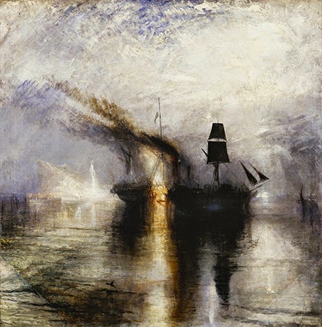
Some of the classics on display are Rain, Steam and Speed (1844) with the Philadelphia Museum’s The Burning of the Houses of Lords and Commons (1834), Burial at Sea (1842) and Snow Storm - Steam-Boat off a Harbour’s Mouth (1842).

Rain, Steam and Speed (1844)
Burial at Sea (1842)
Snow Storm - Steam-Boat off a Harbour’s Mouth (1842)

Late Turner: Painting Set Free as well as unfinished also exhibits watercolours and sketchbooks. So in short, any painting geek who really wants to get under the skin of JWM Turner has every opportunity in this show.


Peder Balke at the National Gallery

I don’t know why but I’ve always been a sucker for Scandinavian stuff whether it be my love of Tove Jansson’s Moomins and her sparsely written adult fiction, Vikings and Norse mythology, my fascination with Nowlegien Black Metal and the Gothenburg melodic death metal scene, the recent RSA travel awards depictions of Antarctica by Frances Walker, the vonlenska folk styled falsettos of Icelandic post-rock group Sigur Rós, to the modern gothic Frankenstein esc classic ghost story set in Svalbard written by Michelle Paver ‘Dark Matter’. Generally culture from that part of the world tends to draw my attention. I don’t know why -maybe it’s my northern roots showing themselves. Either way the Norwegian artist Peder Balke, whom I hadn’t heard of until recently really caught my eye. In defense of my ignorance I don’t think he particularly well known outside his own country. 

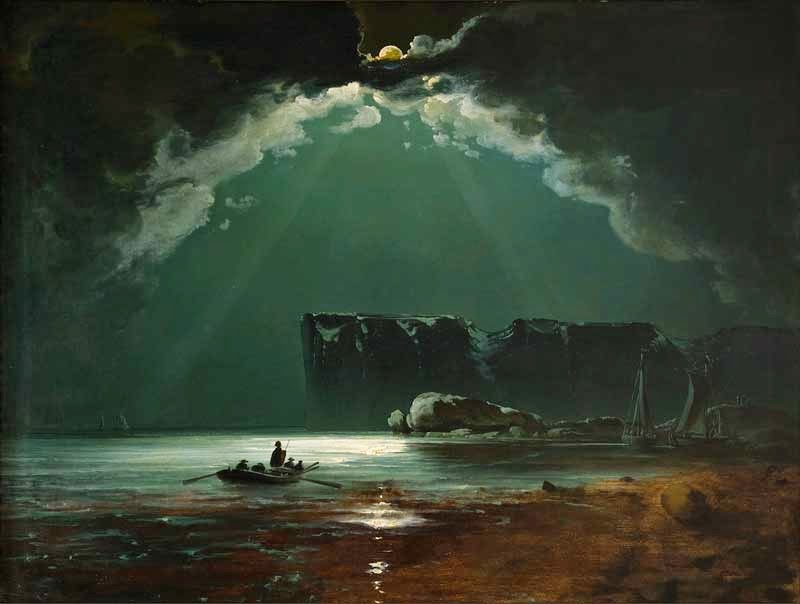
North Cape (probably 1840s) by Peder Balke
Peder Balke (1804-1887) is one of the most innovative and original artists at the moment the Romantic era gave way to the Modern. In order to depict the sublime landscapes of his native Norway, he invented a highly experimental technique. For this, he was greatly criticized during his lifetime, and eventually forgotten. In retrospect being shunned by the elite for starting to develop your own experimental style is something of an artistic badge of honor.

The Trolltindene Range (1845) by Peder Balke
By 1832, the 28-year-old Peder Balke was already noted for his indefatigable walking tours of Southern Norway in search of landscape motifs. That year his horizons expanded as a ship carried him due north along the rugged coast high above the Arctic Circle, beyond the North Cape to the border of Russia. It was further than any Norwegian artist before him had traveled for his art. Balke repeatedly returns to a few landscape motifs like the Northern Cape and he usually relies on a surprisingly simple compositional formulae; for the most part, his pictures consist of horizontal strata rising up the picture plane one atop another to represent various combinations of sea, shore, cliff, mountain ranges and sky. In some pictures the horizontal strata are intersected by a single, resonant vertical – a lighthouse or a jagged peak – charged with symbolic import. Depiction of given motif slowly became for Balke a forum for experimentation with colour, light effects and paint-handling techniques.

Balke’s earlier works executed between the 1840’s and 1850’s are very competent Scandinavian landscapes what really got my inner painter excited was his 1860’s onwards work. The depicted landscapes become whiter, starker and more minimalistic with cold seascapes and epic mountain ranges. This bleaker subject matter is also mirrored in his painting style which becomes more impressionist and the canvases less ‘finished’. Paint has often been rubbed back leaving nothing behind but the white ground primer layer and often exposing the texture of the wooden board beneath. It’s a painting technique that seems to become Balke’s signature style.

Mount Stetind in Fog (1864) by Peder Balke
 
North Cape (1860s) by Peder Balke

One of many 'North Cape's (pictured above) this is representative of his process. Here, thinned washes of paint flow across the ground prime layer until, it seems, they draw fourth the scene inherent in the flow of the medium.
Sun Breaking Through Clouds at Vardøhus by Peder Balke

Some of the bleak expressionism qualities of Balke's work bring to mind The Scream fellow Norwigian artist Edvard Munch. I can't help wondering if there isn't a little influence.


Rembrandt: The Late Works - National Gallery


This exhibition really knocked me of my feet. I know that’s what all these blockbuster style exhibitions promotions promise, but it’s the first time in awhile that one of theses high profile shows has really blown me away! Obviously I’m familiar with Rembrandt and his later works. For the uninitiated basically during his later days Rembrandt’s painting style became more expressive - much to the horror of the established art elite at the time - and his works became much less fancifully, more expressive and more personally introspective. Rembrandt had always been an incredible painter but it this surprise burst of creativity and experimentation so late in his career that’s really cemented his position as one of histories greats. Not unlike Turner (and Balke) its this later more expressive style that present day art historians now recognize as one of Modern Arts early milestones giving birth to Impressionism and the likes.

Self-Portrait (1669) at the Age of 63
Seeing so many Rembrandt’s in one place is truly a humbling experience. To my eye what makes his portraits really stand out is that they seem almost sculpted rather than painted due to his use of tone and Illuminance high-lights, the faces really seem to bulge right out of the canvases. Its worth noting that this exhibition is really well hung the walls are colored a murky dark grey/mauve the ambient room lighting is dim with each individual frame is lit via focused spotlights. This has the over-all effect of really causing the faces to burst out the frames emerging from the dusky shadows. The gallery lighting also really helps the golden jewelry. I’d never quite appreciated how the decorative gold ornaments on Rembrandts sitters really do glisten, and again this effect is aided by the gallery spotlights. The sitters are often dressed up in all the pomp you expect from seventeenth century aristocratic Dutch merchants and if anything Rembrandt proves himself as the painter of gold and light. The ornate jewelry isn’t necessarily painted in fine detail but in thick swabs and chunks of oil paint the overall effect means the glistening highlights almost look like liquid mercury dripping over the sitters –a painting effect aided by the darkened gallery space and powerful lighting arrangements. It’s worth mentioning that a small downside of this hanging arrangement is that it causes some of the higher hung larger paintings to reflect the spotlights off the glossy painting surface making them hard to view from certain angles. Whilst talking about the way Rembrandt thickly applies gold its worth mentioning that he has a tendency of thickly applying paint to the bulbous features of his sitters faces this makes the noses and wrinkles really stand out. It’s these textural details that I think give his portraits their more sculptural qualities. Not to say Rembrandt is all about thick textures, highlights and dark tones. Where it really counts Rembrandt knows how to deftly niggle out fine details around eyes and lips and draw you (the viewer) in. Its a display of pure draftsmanship and its this majesty that really gives Rembrandt’s paintings a dramatic punch.

Some of the works seem to possess an Illuminant golden glow of their own
 in the gallery space.


Thematically the paintings in ‘The Late Works’ are separated through seven rooms and each rooms paintings are hung in series by a theme. For instance Room One ‘Self-Scrutiny; Rembrandt considers the his own ageing features’ contains several different Rembrandt self portraits spanning two decades of the later period, where-as Room Four holds ‘Artistic Conventions; Rembrandt brings new energy to traditional painting formats’ this room contains a series of paintings where Rembrandt pushes the boundaries of traditional approaches to iconography and portraiture with his own vision. For instance in the portrait of Margaretha de Geer wife of Jacob Trip Rembrandt honored the advancing age of the wealthy Dordrecht merchant and his wife by using what resembles a delicate, almost Impressionistic touch to expresses their physical frailty. 

I quite like this thematic hanging arrangement, as apposed to say a chromatic hanging arrangement. This way you get to see how old Rembrandt develops a single theme over the course of several decades this for instance being most obvious in depictions of himself.

I also had a little moment of civic pride seeing a painting normally kept in Glasgow's own Kelvingrove Museum. A Man in Armour (1655) was hung in Room Six 'Contemplation' and really stood out as one of the best paintings in that particular section (see image bellow)!

Harmenszoon van Rijn, A Man in Armour (1655)

Lucretia (1664)

Self Portrait (1658) (Frick Collection)
Seriously though look at the gold, these photo's don't do the paintings justice. Rembrandt’s, like the king of bling! 

The Conspiracy of the Batavians under Claudius Civilis' (1661-62) (cut-down)
The exhibition also includes The Conspiracy of the Batavians under Claudius Civilis' (1661-62), originally Rembrandt’s largest and most prestigious painting. Owned by the Royal Swedish Academy of Fine Arts, the painting has been at the National museum of Art in Stockholm for more than 150 years, leaving Sweden only twice in that time, in 1925 and 1969. Both of those occasions were for showings at the Rijksmuseum. So, this very famous painting is basically one of the many reasons why this exhibition is very special.

Summing up, this a fantastic exhibition well worth seeing! 

Christy

Thursday, 6 November 2014

Tom McKendrick: SOLDIERS'

Exhibition Update!  This weekend I had the pleasure of being introduced to Tom McKendrick at the opening of his new exhibition entitled 'Soldiers', meeting him brought back some old memories of of my early artistic days. Whilst studying HNC Portfolio Building at Dundee College I still remember very clearly a tutor showing me a video made by STV of Tom McKendrick's 'Submarine' exhibition.

The film's now on youtube (see below) although It's dated its very much worth a watch).


In recent months I've been working at The Royal Highland Fusiliers regimental museum in Glasgow and it just so happens that Colonel Steele the Regimental Secretary for The Royal Highland Fusiliers has become part of Tom McKendrick's latest project, 'to turn incisive eye to the human condition in the context of conflict'. For his new project Tom has abandoned his usual abstraction for a more figurative style and is aiming over the next four years to paint 100 portraits of individuals who have served their country.

Colonel Steele's portrait is now on display with the rest of the soldiers Tom has painted thus far at House For an Art Lovers Studio Pavilion. The 'Soldiers' exhibition is well worth checking out!

(above)
Corp James Smith


 Here's some pictures from the opening event.

 
Soldiers!


Colonel Steele in front of his portrait!


Colonel Steele and Tom McKendrick with centurion and Dunkirk Veteran Jimmy Gillies.


The portrait of Colonel Steele up close.


I've added a link and transcript from Tom McKendrick website bellow:

Tom McKendrick Soldiers website

THE FIRST OF 100 PORTRAITS OF SOLDIERS

The relationship between artists and soldiers is a long one. Rembrandt , Dix, Palmer, Bone, Orpen, Nash, Goya, to name a few, painted soldiers or produced work on military themes. Tom in this project has abandoned his usual abstraction to turn incisive eye to the human condition in the context of conflict. Over the next few years he will paint 100 portraits of individuals who have served their country.  You can follow the development of this project as new images will be added when they become available. Images can be mouse clicked to enlarge or run as a slide show. All images are 40" x 44" approximately and are executed on Kraft paper in watercolour, pastel or acrylic or a mixture of all three.

Sunday, 12 October 2014

Craft Café

Volunteering update! I've recently been volunteering in the local Govan area for an organisation called Impact Arts.

Since February I have been running a series of weekly drawing and painting workshops at a local community centre in Govan for a group called ‘Craft Café’ ran in partnership with the Elderpark housing association and Impact Arts. Craft Café is an initiative designed to help facilitate later life learning and tackle social isolation in the elderly. These classes require particular sensitivity as the learner’s age’s range between 65 and 90 years and they all have individual health concerns and requirements. 

See the pictures below:


I was featured a couple of months back in ‘Casting On’ which is a new project co-run by Voluntary Arts Scotland and Volunteer Scotland, funded by Spirit of 2012 Trust, which aims to bring together cultural groups looking for volunteers, who have an energy and enthusiasm for arts volunteering. 

They've just posted the video online feel free to click on the link down below to watch it. My interview segment starts at about two minutes in!


My Interview face.....